


A crypto candlestick chart shows how a cryptocurrency's price moved during a selected timeframe. Each candlestick records OHLC: the open price, high price, low price and close price for that interval. A candle can represent one minute, one hour, four hours, one day, one week or another period. It describes what price did during that period, not what Bitcoin or another asset will necessarily do next.
Crypto adds an important wrinkle to technical analysis. There is no single universal venue for cryptocurrency trading, so candles can differ between one crypto exchange, trading pair, price feed or instrument and another.
This guide reflects current crypto charting conventions and exchange price feeds checked at publication. It explains how to read an individual candle, combine candles across timeframes, interpret common patterns and avoid common mistakes.
Editor's Note (Aug. 15, 2026): We fully updated this guide in August 2026 to reflect current crypto charting conventions and make candlestick analysis clearer and more practical for everyday traders. The refresh adds a step-by-step framework for reading OHLC candles, clearer explanations of timeframes, live vs. closed candles, volume, trend, support and resistance, and stronger guidance on interpreting common candlestick patterns without treating them as predictive signals. We also added coverage of why candles can differ across exchanges and trading pairs, spot vs. futures charts, last price vs. mark and index price, a worked Bitcoin example, common mistakes and a practical candlestick-reading checklist.
Crypto Candlestick Charts: Quick Answer
A crypto candlestick shows an asset's open, high, low and close prices during a selected timeframe. Candles are most useful when read alongside trend, support and resistance, trading volume and surrounding price action rather than treated as standalone predictions.
Crypto Candlestick Key Points
-
Start with OHLC Every candle records the open, high, low and close for one timeframe, while the body and wicks show how those prices relate.
-
Check the timeframe first A 1-minute candle and a daily candle summarize very different amounts of trading activity, even when their shapes look similar.
-
Wait for the candle to close A live candle can still change its body, color, high, low and apparent pattern until the selected interval ends.
-
Read patterns in context Doji, hammers, engulfing candles and other patterns become more useful when combined with trend, support, resistance and volume.
-
Check the market and price feed BTC/USD spot, BTC/USDT spot and BTC perpetual futures can produce different candles because they use separate markets and executed trades.
-
Candles are not predictions Candlesticks describe recorded price action. No individual candle or pattern guarantees what a cryptocurrency will do next.
Disclaimer
This guide is for educational purposes only and is not financial or trading advice. Cryptocurrency trading involves risk, and technical analysis cannot guarantee future price movements.
Disclosure
Some links in this guide may be affiliate links. If you choose to use a service through these links, we may earn a commission at no additional cost to you.
What Is a Crypto Candlestick Chart?
A candlestick chart turns a stream of market prices into consecutive candles, with each candle representing one fixed interval. Standard candlesticks preserve four prices: open, high, low and close, while the candle body and wicks show how those values relate visually.
| Component | What it shows |
|---|---|
| Open | First traded price during the interval |
| High | Highest traded price |
| Low | Lowest traded price |
| Close | Final traded price when the interval ends |
| Body | Distance between open and close |
| Wicks | Prices reached above or below the body |
The candle body spans the open and close. The upper wick, sometimes called the upper shadow, runs from the body to the high. The lower wick extends from the body to the low.
A bullish candle usually appears green because its close is above its open. A bearish candle usually appears red because its close is below its open. Platforms can use different colors, and some allow traders to change the coloring rules entirely.
Candle color also does not tell you whether price finished above or below the previous candle. A green candle means the current close is above the current open. The asset can still finish below the previous candle's close if the new interval opened sufficiently lower.
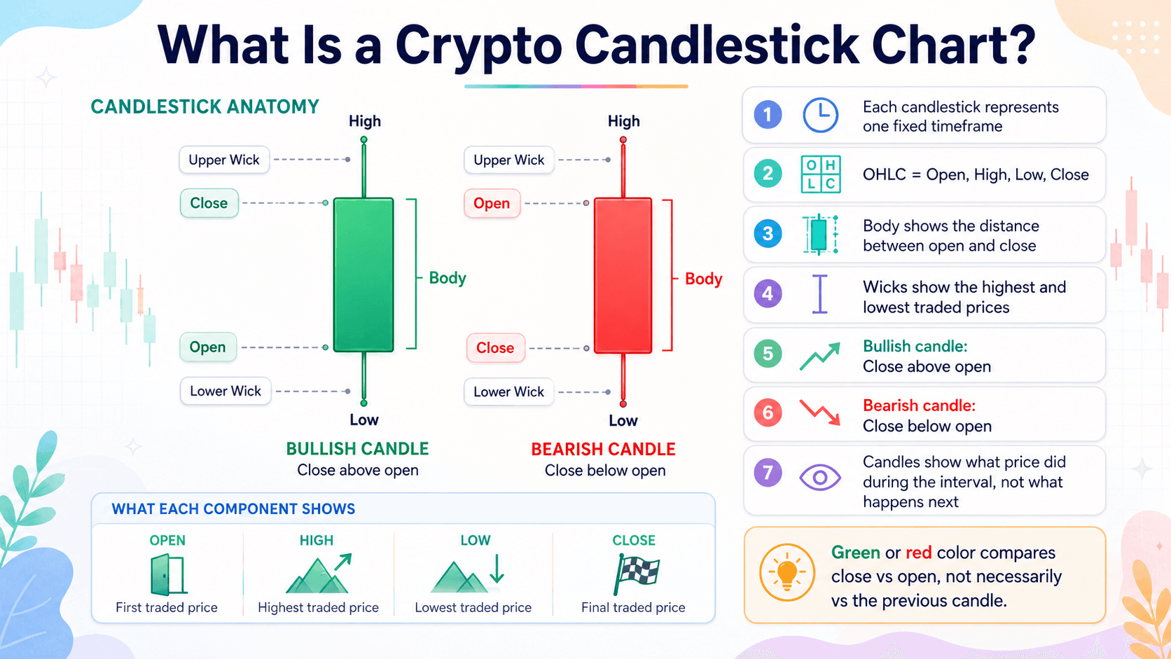 Crypto Candlestick Anatomy, OHLC, and Bullish vs Bearish Basics
How Is a Crypto Candlestick Created?
A candle is built from trades that actually execute during its timeframe. For a one-hour candle, the first executed trade becomes the open, the highest executed price becomes the high, the lowest executed price becomes the low and the final executed trade before the hour ends becomes the close.
Trades during the same interval also contribute to trading volume.
A simple example makes it
+-7easier to see:
Open $100 → High $108 → Low $97 → Close $105 = bullish candle with a $5 body and a price range from $97 to $108.
Candles are built from executed market trades, not every buy and sell order sitting in the order book. A bid represents an order to buy and an ask represents an order to sell. A limit order specifies a price at which someone is willing to trade, but it does not enter OHLC data merely because it appears in the book.
Suppose a seller places a $110 limit order while the market trades around $105. If nobody executes against that order and the seller later cancels it, the candle does not receive a $110 high. An executed trade must actually reach $110.
Data providers can also construct and return candles differently at the edges.
How to Read a Crypto Candlestick in 5 Steps
Candlestick reading becomes much easier when every candle is approached in the same order. Start with the timeframe, establish the open and close, inspect the body and wicks, then compare the candle with the surrounding price action.
1
Step 1: Check the Candle's Timeframe
Identify how much market activity each candle summarizes.
Step 1: Check the Candle's Timeframe
A timeframe tells you how much market activity has been compressed into each candle. A 1-minute chart creates one candle per minute, a 1-hour chart summarizes one hour, a 4-hour chart summarizes four hours and a daily chart summarizes one day.
The same candle shape can carry very different weight on different chart intervals. A large wick on a 1-minute chart may record a movement lasting only seconds. A similar wick on a daily chart records an excursion that happened somewhere during a full day's trading.
Short intervals also contain far more observations. One day contains 1,440 one-minute intervals but only six 4-hour intervals. Very short charts can therefore expose substantially more market noise.
2
Step 2: Find the Open and Close
Use the opening and closing prices to determine the candle's direction.
Step 2: Find the Open and Close
Next, locate where the interval began and where it finished. If the closing price is above the opening price, the candle is bullish. If the closing price is below the opening price, it is bearish.
The distance between those prices shows net movement during the interval. If Bitcoin opens at $64,000 and closes at $64,800, the body records an $800 move from opening price to closing price even if BTC traveled much farther between the high and low.
For example, assume one candle closes at $65,000. The next opens at $63,500 and closes at $64,000. The second candle is bullish under the standard color convention because it gained $500 from its own opening price, yet it still finished $1,000 below the preceding close.
3
Step 3: Read the Size of the Body
Compare the opening and closing prices without ignoring the full range.
Step 3: Read the Size of the Body
The candlestick body measures the distance between open and close. A large body means price finished relatively far from where the interval began. A small body means the open and close were relatively close together.
A long bullish body shows that price closed substantially above where the interval began. Traders may describe the surrounding move as bullish momentum or buying pressure when trend, volume and subsequent price action support that reading. A long bearish body can accompany bearish momentum or selling pressure.
A small body also does not automatically mean low volatility. Consider a candle that opens at $100, trades to $115, falls to $85 and closes at $101. Its body is only $1, but its total price range is $30.
4
Step 4: Read the Wicks
Use the high and low to see where price traveled beyond the candle body.
Step 4: Read the Wicks
The upper wick runs from the body to the highest price traded during the interval. A long upper wick means price moved materially above the open/close area but did not remain there through the close.
The lower wick extends to the low price. A long lower wick means price traded materially below the body and recovered before the candle ended.
- Countervailing buying or selling
- Liquidations in leveraged markets
- Thin liquidity
- Breaking news
- A large market order
- Stop execution
Crypto markets make this distinction especially useful. A leveraged perpetual market can experience a liquidation cascade, while a thin spot pair can print an extreme price after one order crosses a shallow order book. Both can leave long wicks, but the underlying mechanisms are different.
5
Step 5: Compare the Candle With What Came Before
Place the candle within trend, volume, support and resistance context.
Step 5: Compare the Candle With What Came Before
An isolated candle leaves out information that often changes its interpretation. Compare it with the surrounding price action before assigning meaning to the shape.
Identify the broader market trend first. Ask whether price is in an uptrend, downtrend or consolidation. Check whether the candle is unusually large relative to nearby candles, whether it formed near previous support or resistance and whether trading volume increased.
Repeated behavior around the same level can add useful context. Several long lower wicks around a support area tell you that price has repeatedly traded below nearby bodies and recovered. The same wick appearing in the middle of an unstructured range carries less contextual information.
Then check what happened afterward. A subsequent candle can support the original interpretation, weaken it or contradict it.
How Crypto Candlestick Timeframes Work
Changing timeframe does not create a different underlying stream of trades. It changes how those trades are grouped, which can dramatically alter what a chart appears to show.
How Lower-Timeframe Candles Form Higher-Timeframe Candles
Four 15-minute candles cover one hour. Four 1-hour candles cover four hours, and six 4-hour candles cover 24 hours.
16 × 15m candles → 4 × 1H candles → 1 × 4H candle
The higher-timeframe candle takes its open from the first lower-timeframe candle, its close from the final one, its high from the highest price reached anywhere in the group and its low from the lowest.
A bullish 4H candle can therefore contain several bearish candles on a 15-minute chart. Bitcoin might fall during the first hour, recover during the second, trade sideways during the third and rally during the fourth. The 4H candle compresses that entire journey into one set of OHLC values.
Multi-timeframe analysis exposes different levels of that price path. A lower timeframe shows more of the intraperiod movement, while a higher timeframe compresses those trades into fewer candles. A pattern visible on a 15-minute chart can disappear completely when those candles are aggregated into a 1-hour or 4-hour chart.
The reverse can also happen. Several lower-timeframe movements that look unrelated may combine into a recognizable daily candle once the chart is zoomed out.
Live Candles vs Closed Candles
A live candle is still being formed. Its values continue responding to the real-time price information supplied by the selected exchange or price feed. Until the chart interval ends, its close is effectively the latest trade price used by that feed, so its color, body length, closing price, upper wick and lower wick can continue changing.
A candle that resembles a hammer at 10:45 can look entirely different when the 1-hour interval ends at 11:00.
Kraken's public OHLC endpoint explicitly identifies the final returned entry as the current, not-yet-committed timeframe. TradingView likewise maintains a Countdown To Bar Close display for fixed-time intervals, allowing users to see how long remains before the current bar closes.
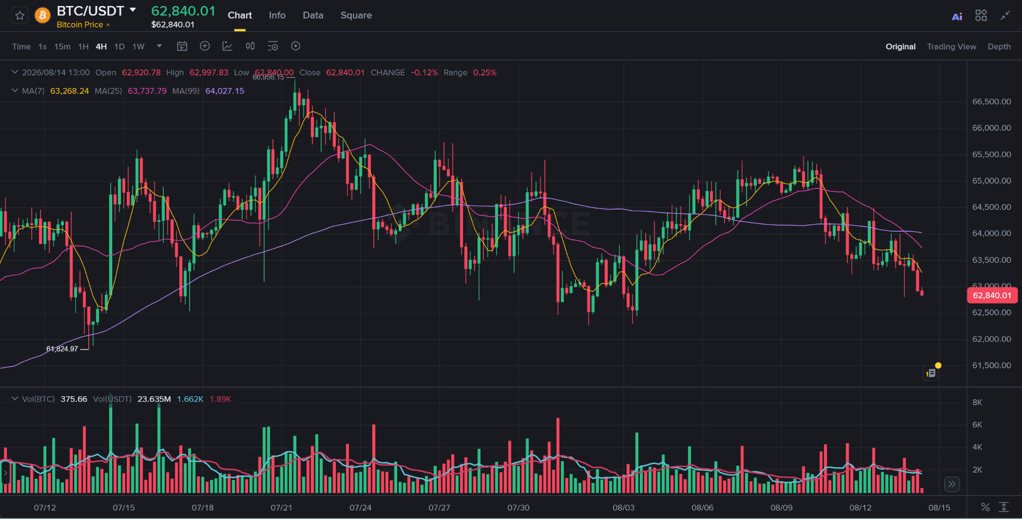 Live BTC/USDT 4H Candlestick Chart Showing an Unfinished Bitcoin Candle
A live Bitcoin candle can still change its body, wick structure, and closing value until the 4-hour interval ends.
Traders therefore distinguish between a current/live candle and a closed/confirmed candle. Once the candle closes, its final OHLC values for that feed are fixed. Waiting for closure does not guarantee that the interpretation will be profitable. It simply prevents a trader from treating an unfinished shape as though it were already final.
Which Timeframe Should Beginners Use?
Very short trading timeframes contain more market noise and require faster decisions. A 4-hour chart and daily chart often make broader structure easier to see because many small intraday movements have already been compressed.
Day trading can require lower chart intervals for entries and exits. Swing trading usually places more emphasis on 4H, daily or other higher-timeframe structure because positions can remain open for several days or weeks.
There is no universally best timeframe. The interval should match the decision horizon rather than being selected because a pattern looks cleaner on it.
Beginners can often learn more comfortably on 4H and daily charts before moving into faster intervals.
Our crypto trading hours guide explains how lower and higher timeframes fit into continuous 24/7 crypto markets.
How to Read Candlesticks in Context
Candlestick shapes become more informative after trend, location and market participation are established. Those elements prevent a familiar pattern from being interpreted the same way everywhere on a chart.
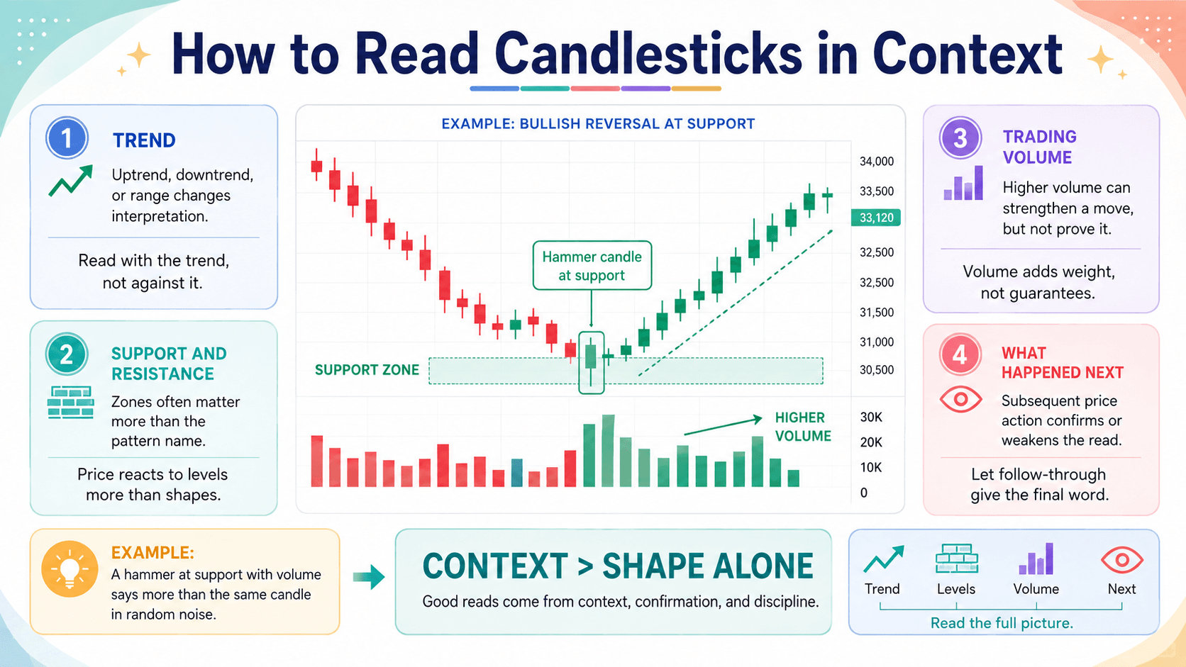 Trend, Support, Volume, and Follow-Through Give Candlesticks Meaning
Trend
An uptrend commonly produces higher highs and higher lows. A downtrend tends to produce lower highs and lower lows, while a sideways market rotates through a range without establishing sustained directional price structure.
A bullish candle inside an established uptrend records different context from an identical bullish candle appearing after a major decline. The first may occur during continuation, while the second could be part of a short-lived rebound or an attempted reversal.
The trend label should describe price structure rather than become a forecast. A higher high tells you what price has already done. It does not guarantee another higher high.
Support and Resistance
Support is an area where previous declines have repeatedly slowed, stalled or reversed. Resistance is an area where previous advances have encountered difficulty. Both are usually more useful as zones than as perfectly precise prices.
Location can provide more information than the pattern's name.
A hammer appearing in random price noise offers weak information. A hammer forming around a support zone that has already been tested several times has additional context because traders can compare the new reaction with earlier price action.
That still does not guarantee a reversal. Support can break, and resistance can fail.
Breakouts also deserve confirmation. A candle closing above resistance carries more weight when later price action remains above the former resistance zone than when the next candle immediately falls back into the old range.
Trading Volume
Trading volume shows how much trading occurred during a candle or interval. A volume bar beneath a candlestick chart lets readers compare current participation with nearby periods.
High volume can show that a price movement involved more trading activity than surrounding candles. A breakout accompanied by expanding breakout volume may therefore deserve more attention than a similar move occurring on unusually low activity.
Volume confirmation should not be described as proof. High-volume breakouts can fail, while low-volume movements can continue farther than expected.
Volume is the main confirming tool worth emphasizing while learning candlesticks. A moving average can help smooth trend visually, but beginners usually gain more from reading price movement, structure and volume before layering several technical indicators onto the same chart.
Crypto Candlestick Patterns Worth Knowing
Pattern names are shorthand descriptions of price behavior. They should not be treated as automatic buy or sell signals. Their relevance changes with the preceding trend, location, trading volume and subsequent price action.
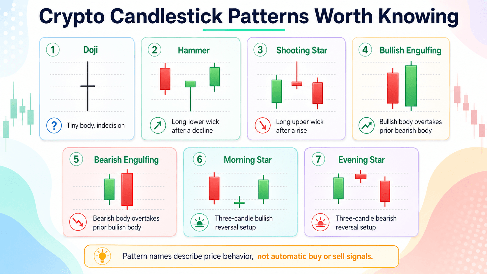 Key Crypto Candlestick Patterns, from Doji to Morning and Evening Stars
Doji
A Doji has a very small or nearly nonexistent body because its open price and close price are close together.
Its wicks can still be large. A Doji can therefore represent an interval with substantial volatility even though the market finished near where it began.
The pattern is often associated with market indecision because neither direction produced much net movement between open and close. Its relevance changes with context.
A Doji after a sustained rise or fall may attract attention as a possible reversal pattern. A Doji in the middle of choppy consolidation can add very little information because indecisive price behavior is already normal there.
Hammer and Shooting Star
A hammer candlestick has a relatively small body and a long lower wick. It receives the most attention after a decline because price traded substantially lower during the interval and then recovered toward the open/close area.
A hammer can form part of a bullish reversal setup, but the candle does not prove that a reversal has begun.
A shooting star has a small body and long upper wick. It is most relevant after a rise because price traded materially higher and then finished closer to the lower part of its range.
It can form part of a bearish reversal setup, but subsequent price action still needs to be checked.
| Pattern | Typical Context | Main Structure |
|---|---|---|
| Hammer | After a decline | Small body, long lower wick |
| Hanging man | After a rise | Small body, long lower wick |
| Shooting star | After a rise | Small body, long upper wick |
| Inverted hammer | After a decline | Small body, long upper wick |
A hammer and hanging man can have virtually the same geometry. The preceding trend changes the pattern name and conventional interpretation.
The same relationship exists between a shooting star and inverted hammer. Shape alone is insufficient.
Bullish and Bearish Engulfing Patterns
Bullish and bearish engulfing formations use two candles.
In a bullish engulfing pattern, the second candle's bullish body overtakes the previous bearish candle's body. In a bearish engulfing pattern, a bearish second body overtakes the prior bullish body.
Trend and location influence interpretation. A bullish engulfing setup after a decline around support has more relevant context than the same two-candle pattern appearing in the middle of a sideways range.
Definitions differ over whether the second candle must engulf every wick. Many conventional implementations focus on the real bodies.
Anyone backtesting engulfing patterns should choose one definition in advance and apply it consistently. Changing the rules after seeing the historical outcome introduces selection bias.
Morning Star and Evening Star
A morning star is a three-candle pattern usually discussed following a decline. It starts with a bearish candle, moves through a smaller middle candle and finishes with a bullish candle that recovers a meaningful portion of the first candle's decline.
An evening star applies the opposite sequence after a rise: a bullish first candle, a smaller middle candle and a bearish third candle that reverses part of the earlier advance.
These formations illustrate an important principle: sequence > isolated candle.
A three-candle pattern records how price behavior changed across several intervals. It can provide more context than one bar, but neither a morning star nor evening star guarantees a trend reversal.
How to Confirm a Candlestick Pattern
Candlestick confirmation becomes more useful as independent pieces of price information align. A simple hierarchy is:
Pattern alone
Pattern + appropriate preceding trend
Pattern + relevant support/resistance
Pattern + trading volume
Pattern + subsequent price confirmation
Each layer adds context rather than certainty.
Invalidation should also be defined before a trade or forecast is evaluated. Suppose a bullish pattern forms around a support zone and the interpretation assumes that support will hold. A decisive move below the zone can invalidate the original reading.
Without an invalidation condition, traders can keep redefining a false signal after the market has already contradicted it.
Do Candlestick Patterns Actually Work in Crypto?
Yes, candlestick patterns can provide useful context in crypto, but no pattern reliably predicts the next move on its own. Candlesticks are descriptive market data. Pattern analysis groups recurring structures, while predictive value has to be tested rather than assumed.
Recent crypto-specific research provides stronger evidence than relying entirely on decades-old stock-market studies. A 2026 study in the International Review of Economics & Finance analyzed hourly OHLC data from July 2018 through January 2022 for nearly 400 cryptocurrencies, around 2,000 trading pairs and 36 exchanges, totaling roughly 200 million observations.
Researchers Stefanie Moser and Alexander Brauneis tested 55 reversal patterns and found statistically significant forecasting evidence for some formations. Predictive performance differed across individual patterns, while the authors reported that their results remained robust across time, market conditions, cryptocurrencies and exchanges. The peer-reviewed candlestick study is one of the broadest recent tests available.
Those findings do not establish a universal trading edge. Statistical predictability and profitable execution are separate questions, especially after transaction costs.
A 2026 walk-forward Bitcoin study examined roughly 70,000 hourly BTC-USDT observations from 2018 through 2026 using a 27-fold walk-forward protocol. Its machine-learning models generated positive gross results in selected configurations, but simple high-turnover strategies failed when the researchers imposed 10 basis points of transaction costs. Cost-aware execution reduced turnover and improved selected results. The Bitcoin transaction-cost study was published in May 2026.
A separate July 2026 audit of candle-based Binance Spot timing models also found that strong predictive metrics did not automatically translate into profitable executable strategies after assumed trading costs.
Several factors can change apparent pattern performance:
- Asset and trading pair
- Timeframe
- Market regime
- Pattern definition
- Historical sample period
- Fees and transaction costs
- Slippage
- Selection and hindsight bias
Backtesting applies defined rules to historical data, but a result from one sample does not establish a fixed probability that the same pattern will succeed in future market conditions. Backtesting also creates opportunities to overfit rules to old data. Our crypto backtesting guide covers realistic fees, slippage, out-of-sample testing and execution assumptions.
The research supports a restrained use of patterns. They can help organize price action, define hypotheses and identify recurring structures. They should not be treated as mechanical forecasts with fixed probabilities across every crypto asset and market regime.
Why Crypto Candlestick Charts Can Differ Between Exchanges
Bitcoin does not trade on one universal venue. Coinbase, Binance, Kraken and other exchanges operate separate markets with their own executed trades, order books and liquidity, so legitimate Bitcoin charts can print different candles for the same period.
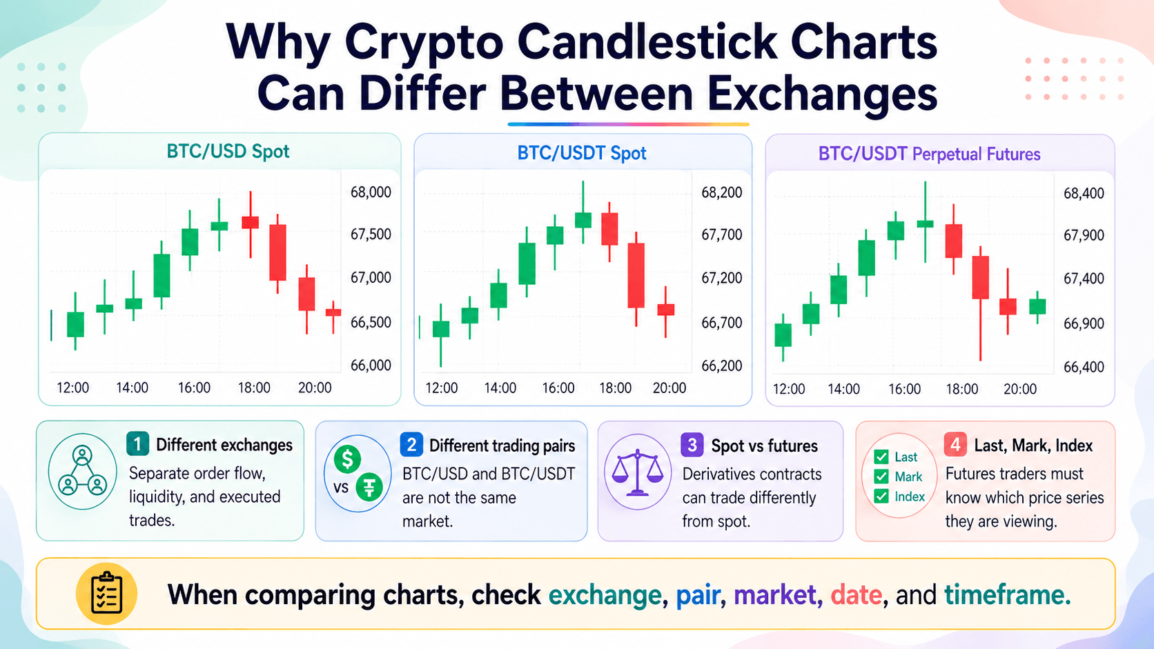 Different Exchanges, Pairs, and Markets Can Produce Different Candles
Different Exchanges, Trading Pairs and Liquidity
Consider three commonly viewed markets:
- BTC/USD on Coinbase
- BTC/USDT on Binance
- BTC/USD on Kraken
Each has its own order flow, trading volume, liquidity and executed trade history. A price reached on one exchange does not automatically become the high or low on another.
Binance's spot candlestick specification constructs Kline data for the selected symbol, while Kraken streams OHLC updates from trade events for the requested pair.
Liquidity can magnify the difference. A large market order on a shallow venue may consume several price levels and leave an unusually long wick. A deeper exchange might absorb a similarly sized order with much less price movement.
The quote asset can also differ. BTC/USD expresses Bitcoin's value in US dollars. BTC/USDT expresses it in Tether. Although the markets usually trade close together, they are not one order book.
Publication-time market pages also illustrate the fragmentation. On Aug. 15, 2026, Coinbase's public Bitcoin page and Kraken's BTC/USD market page showed slightly different Bitcoin prices because each source used its own market data and update time. Binance maintained a separate BTC/USDT spot order book. These should not be interpreted as a synchronized arbitrage comparison because webpage timestamps are not identical.
When comparing charts, record four details: exchange, trading pair, date and timeframe. A wick on one feed can be perfectly valid even when another exchange never traded at that price.
Spot vs Futures Candles
A spot chart represents trades in the underlying spot market. A futures chart represents trades in a derivatives contract, including perpetual futures and dated futures contracts.
Those markets have separate order books and participants. The futures price can therefore trade above or below the corresponding spot price, especially during fast markets or periods of leverage-driven positioning.
Perpetual futures also use a funding rate mechanism designed to help keep contract prices anchored around underlying spot-market references over time. Temporary differences can still occur.
A BTC/USDT spot candle can therefore have a different open, high, low, close, wick or trading volume from a BTC/USDT perpetual futures candle covering the same four hours.
Binance's USDⓈ-M futures market-data documentation publishes separate candlestick endpoints for contract price, index price and mark price.
That separation is particularly important for leveraged traders. Reading a futures chart as though it were an ordinary spot price feed can lead to confusion around liquidations and temporary price differences.
Last Price, Mark Price and Index Price
Last price is the most recent trade executed in the selected market. If the latest BTC perpetual trade occurred at $64,000, then $64,000 is the last price until another trade executes.
Index price is a reference price index constructed from selected external spot markets or other price sources. The exact methodology, weighting and source selection depend on the derivatives platform.
Mark price is a calculated reference used by many perpetual futures platforms for functions such as unrealized PnL and liquidation logic. It is designed to reduce the effect of temporary distortions in the contract's last traded price.
Binance's futures liquidation documentation states that last price represents the contract's latest transaction, while mark price is calculated using funding information and a basket of spot-price data. Binance uses mark price for unrealized PnL and liquidation calculations.
A futures trader therefore needs to know which price series the chart is displaying.
A sharp wick can appear in the perpetual contract's last-price chart without appearing identically in mark-price candles. A trader monitoring liquidation price while looking at the wrong series can misread how close the position is to forced closure.
Worked Example: How to Read a Bitcoin Candlestick Chart
A worked example is more useful when the chart leaves room for more than one outcome. This example uses a real Binance BTC/USDT 4-hour chart shown through TradingView on Aug. 15, 2026.
The first snapshot captures a Bitcoin candle while it was still forming. Its open, high, low, current close field, body and wicks were visible, but more than three hours remained before the interval ended. A later snapshot from the same Binance BTC/USDT 4-hour market shows why subsequent price action still needed to be checked.
| Chart detail | Example |
|---|---|
| Exchange/data source | Binance market data displayed through TradingView |
| Trading pair | BTC/USDT |
| Market | Spot |
| Date | Aug. 15, 2026 |
| Timeframe | 4-hour chart |
| Candle status | Live, with 3:05:14 remaining |
1. Check the Timeframe and Trend
The chart uses a 4-hour timeframe, so every completed candlestick represents four hours of Binance BTC/USDT trading. Six completed 4H candles cover 24 hours.
Before examining the candle on the far right, look at the broader price action. Bitcoin had fallen from the mid-$65,000 area toward the low-$63,000s over the preceding sessions. Short-term price structure had weakened, although the wider chart still looked more like a broad range than a clean one-way downtrend.
The chart also showed nearby horizontal levels. Bitcoin was trading below a reference around $63,600, while another marked level sat near $62,898.
The evidence supported a limited conclusion: short-term price action had weakened and BTC was trading toward the lower part of its recent range. The chart did not establish whether Bitcoin would recover, continue lower or consolidate.
2. Read the Candle
The chart header shows the values recorded for the live candle when the snapshot was taken:
- Open: $63,441.48
- High: $63,578.00
- Low: $63,368.35
- Current close field: $63,494.00
Because the candle was still live, $63,494 was not its final closing price. It was the latest traded price displayed in the close field at the moment of capture.
At that point, the candle had a small bullish body of $52.52, with price sitting slightly above its $63,441.48 open. Its full high-to-low range was $209.65.
The upper wick extended $84 from the current top of the body at $63,494 to the $63,578 high. The lower wick extended $73.13 from the $63,441.48 open to the $63,368.35 low.
Those values describe what price had done so far. Bitcoin had moved both above and below its opening price before returning slightly above the open. They do not reveal why those movements occurred or establish where the candle would eventually close.
The countdown is especially important. With more than three hours left, another price move could enlarge either wick, change the body, move the close or turn the candle from bullish to bearish.
3. Check the Location and Volume
The candle becomes more informative when its location is considered.
Its $63,578 high stopped just below the nearby $63,600 reference level. Its $63,368.35 low remained above the lower marked area around $62,898. BTC was therefore trading between a nearby overhead level and lower support rather than breaking decisively through either one.
The chart also displayed approximately 473 BTC of trading volume for the live candle at the moment of capture.
That figure needs context. The candle still had more than three hours to run, so its volume was incomplete. Comparing it directly with completed 4-hour volume bars would give a distorted picture of market participation.
Several completed candles during the preceding decline had visibly larger volume bars. The live candle had not yet shown comparable evidence of expanding activity.
The evidence at that moment was mixed. BTC had stabilized slightly above its opening price, but it had not moved through the nearby $63,600 level and the candle had not closed. There was no confirmed breakout or reversal.
4. Wait for More Information
The next step is to see whether later price action supports or contradicts the initial reading. A subsequent TradingView snapshot of the same Binance BTC/USDT 4-hour market shows Bitcoin still trading around the mid-$63,000 area rather than immediately producing a clean reversal.
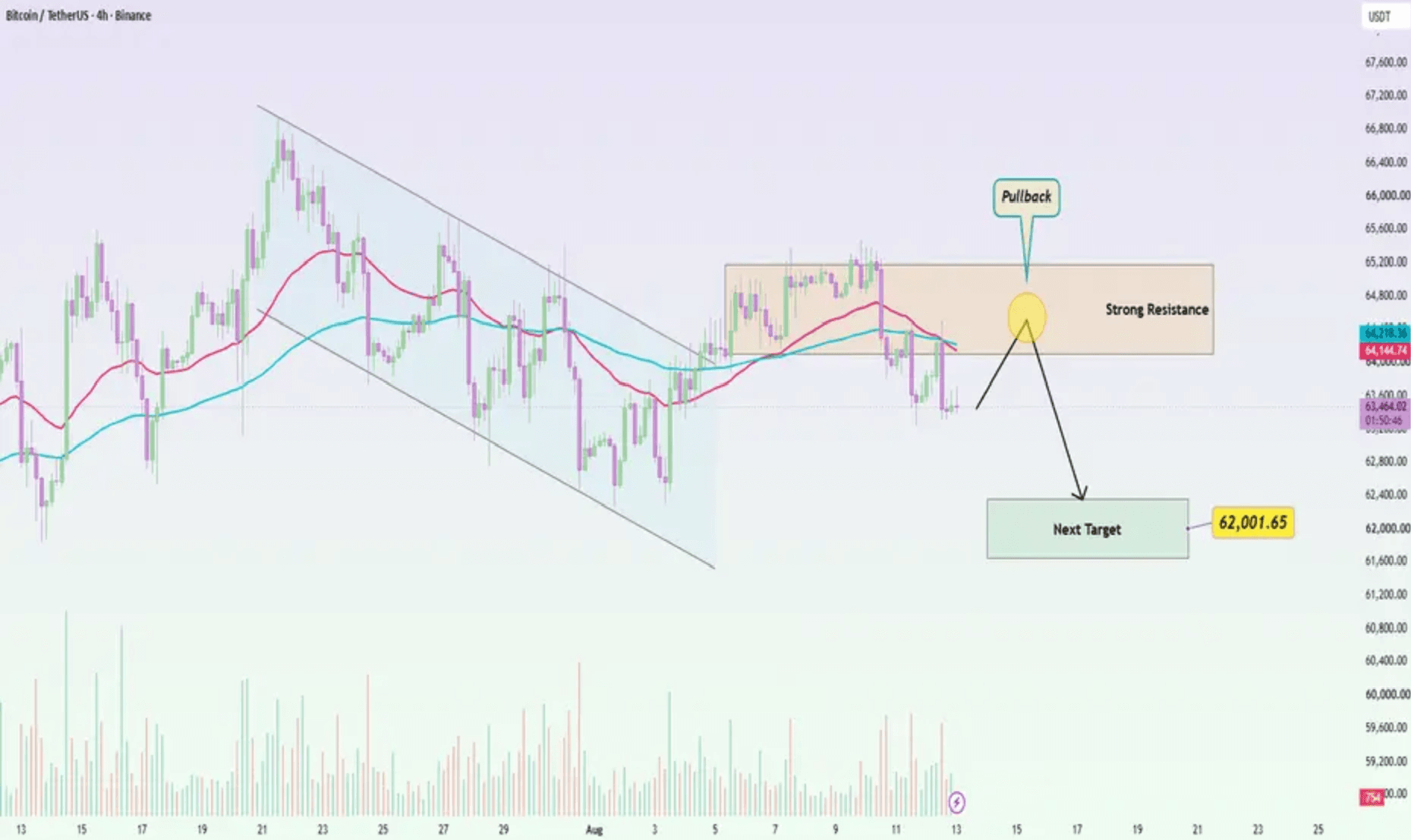 Later Binance BTC/USDT 4-hour chart showing Bitcoin price action after the live candle and resistance between $64,000 and $65,200.
Later Binance BTC/USDT 4-hour price action. Bitcoin was trading around $63,400 and remained below the $64,000 to $65,200 region identified as overhead resistance in the accompanying TradingView analysis. The arrows and moving averages are annotations from the original chart author and are not used as confirmation in this example.
The later price action did not produce an immediate, clean bullish reversal. Bitcoin remained around the $63,400 area and below $64,000.
That outcome is useful because the original candle was ambiguous. It had a small bullish body, upper and lower wicks, incomplete volume and more than three hours remaining before the close. None of those features required Bitcoin to rally afterward.
A reader looking only at the information available in the first snapshot could reasonably make three observations:
- Short-term price action had weakened.
- The lower support area had not yet broken.
- The live candle had not confirmed a move above nearby resistance.
Going further would have required information that was not yet available.
Waiting for the candle to close and then checking subsequent price action provides confirmation or invalidation, not certainty. In this example, the later candles reinforce why an individual Bitcoin candlestick should be read alongside timeframe, trend, support, resistance and trading volume rather than treated as a prediction of the next move.
Common Mistakes When Reading Crypto Candlesticks
Most candlestick errors come from assigning certainty to incomplete, thin or context-free price information. The following mistakes are especially common in crypto.
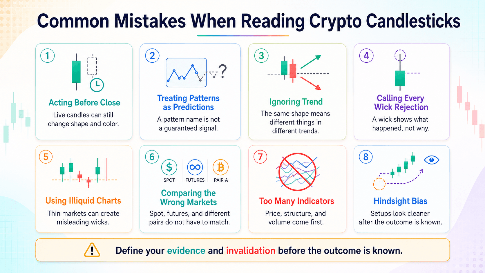 Common Candlestick Reading Errors, from Early Entries to Hindsight Bias
Acting before a candle closes. An unfinished candle can change its body, color, high, low and apparent pattern before the interval ends. A hammer visible halfway through a 1-hour candle may disappear completely by the close.
Treating pattern names as predictions. A hammer is a description of candle geometry. It is not automatically a buy signal, just as a shooting star is not automatically a short signal. False signals occur even when textbook definitions are met.
Ignoring the preceding trend. Pattern context changes interpretation. The same long lower wick can be labeled a hammer after a decline or a hanging man after a rise.
Calling every wick "rejection." A wick tells you that price traded at an extreme and returned before closing. It cannot identify whether the move came from liquidity conditions, liquidations, stop execution, news or ordinary order flow.
Using extremely illiquid crypto charts. Thin trading can produce extreme candles from relatively small executions. A long wick on an obscure pair may tell you more about shallow liquidity than broad market sentiment.
Comparing charts without checking the pair or market. BTC/USD spot, BTC/USDT spot and BTC/USDT perpetual futures are separate markets. Their candles, volume and wicks do not have to match.
Adding too many indicators. An indicator Christmas tree can bury the price data underneath oscillators, averages and colored signals. Beginners gain more from understanding OHLC, trend, support, resistance and volume first.
Studying charts with hindsight. Once the outcome is known, ambiguous setups begin to look suspiciously clever. Hindsight bias makes successful patterns memorable while failed examples disappear from attention.
Confirmation can reduce some of these errors, but it cannot remove uncertainty. Define the evidence and invalidation conditions before the outcome is known.
Crypto Candlestick Reading Checklist
Keep this checklist beside a crypto chart until the sequence becomes automatic.
- What asset and trading pair am I looking at?
- Which exchange or price source is this?
- What timeframe is selected?
- Has the candle closed?
- Where are the open, high, low and close?
- How large is the candle body relative to nearby candles?
- Are either of the wicks unusually long?
- What is the broader trend?
- Is price near support or resistance?
- What does trading volume show?
- Does the next price action confirm the interpretation?
The checklist keeps market identification ahead of pattern recognition. It also reduces the temptation to notice one dramatic wick and build the rest of the analysis around it.

How to Read Crypto Candlestick Charts: Final Thoughts
A crypto candlestick chart compresses trading activity into OHLC data for a defined timeframe. Read each candle in a consistent order: check the timeframe, find the open and close, measure the body, inspect the wicks and then compare the candle with surrounding price action, trend, support, resistance and trading volume.
Individual candlestick patterns do not reliably predict markets on their own. Crypto traders also need to know which exchange, trading pair, market and price feed they are viewing because separate venues and instruments can produce different candles.
Technical analysis always involves risk. Practice reading closed candles, record what information was genuinely available at the time and separate observation from prediction before attaching real money to a chart interpretation.