This guide teaches beginners how to read crypto charts. It focuses on the visual language of charting, not advanced trading strategies, and gives you beginner-safe defaults, simple patterns, and worked examples you can actually follow. It does not cover leverage, derivatives execution, portfolio construction, or price prediction. Instead, you will learn how to read candlesticks, identify trend, mark support and resistance, use volume, and apply a small indicator toolkit without overcomplicating the process. This is a guided first chart lesson, not a giant trading manual.
Editor's Note (April 17, 2026): We fully updated this article in April 2026 to make it more useful for beginners. This refresh tightens the focus around the core skills new readers actually need first: candlestick basics, trend, support and resistance, volume, simple indicators, common patterns, and beginner chart-reading mistakes. We also updated the structure, examples, and guidance throughout to better reflect how crypto charts are read in practice today.
Key Takeaways: How to Read a Crypto Chart Fast
A crypto chart shows how price moves over time, but the goal is not to predict the future with certainty. For most beginners, the best starting point is a candlestick chart on a higher timeframe, then reading the market in a simple order: trend, support and resistance, volume, and one confirming tool from your indicators. This keeps price action analysis clear and helps you frame probabilities instead of reacting to noise.
What a Crypto Chart Tells You
-
A crypto chart shows price movement over time It gives you a visual record of where price has been, how it moved, and where momentum may be building or fading.
-
Most beginners should use a candlestick chart A candlestick chart makes it easier to read structure, momentum, and short-term pressure than a line chart or bar chart.
-
Read charts in this order Start with trend, then mark support and resistance, then check volume, then use one confirming indicator.
-
One candle equals one time period On a 15-minute chart, one candle covers 15 minutes. On a 4-hour chart, one candle covers 4 hours. The timeframe changes what you see.
-
Charts do not predict the future They help frame probabilities, organize decisions, and manage risk more clearly in a volatile market.
The Beginner Workflow in One Glance
- Step 1: Pick a timeframe that slows the chart down enough to make structure visible, usually 4H or 1D for beginners.
- Step 2: Identify the trend by checking whether price is making higher highs and higher lows, lower highs and lower lows, or moving sideways.
- Step 3: Mark support and resistance by looking left and highlighting the zones where price has reacted more than once.
- Step 4: Check volume to see whether the move looks supported by real participation or whether it may be weak.
- Step 5: Use one or two indicators for confirmation, not as a replacement for reading trend and price action first.
- Step 6: Define invalidation before entering a trade so you know where the chart idea stops making sense.
Some links in this guide may be affiliate links. If you choose to buy a hardware wallet through these links, we may earn a commission at no additional cost to you.
This article is educational only and not financial advice. Crypto is volatile, leveraged products can magnify losses quickly, and keeping coins on an exchange adds separate counterparty and custody risks unrelated to whether your chart read was correct. The CFTC’s warning on virtual currency trading is a useful reminder that easy market access does not reduce market risk, while the SEC’s guidance on crypto-asset custody and related risks shows why storage risk sits outside chart analysis. If chart watching turns into compulsive checking, panic, or revenge trading, step away from the screen. A chart is a tool, not a measure of discipline or self-worth.

Crypto Chart Basics Every Beginner Should Understand
Crypto chart basics beginners should understand are the main chart types, how timeframes change what you see, and what each candle’s open, high, low, and close actually mean. It also helps to know that crypto charts often feel faster and noisier than stock charts because the market trades 24/7.
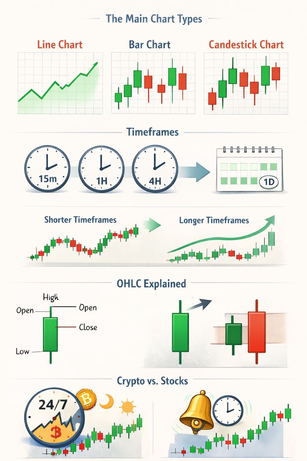 Visual Guide To Crypto Chart Basics, Timeframes, OHLC Structure, And Key Differences From Traditional Stock Charts
The Main Chart Types
Line charts, bar chart and the candlestick charts are usually the first three chart types beginners meet. All three show price, but they do not communicate it in the same way.
A line chart is the most basic. It connects price points over time, usually using the closing price. That makes it useful when you just want a quick read on direction and nothing more. If your only question is whether price has been rising, falling, or drifting sideways, a line chart is enough.
A bar chart gives you more detail because each bar shows the open, high, low, and close. The issue is not that bar charts are bad. They are just not especially friendly when you are new. You can read them, but they take a bit more effort, and most beginners do better with something they can scan faster.
The same information appears on a candlestick chart, just in a format that is easier to interpret quickly. It becomes much simpler to see the open, the close, the trading range, and whether buyers or sellers were more dominant. That is why candlesticks are usually the better default for new traders.
If you want a deeper walkthrough of candle construction and beginner chart reading, our guide to how to read crypto candlestick charts is a strong next step.
| Chart type | What it shows best | Beginner-friendly? |
| Line chart | Overall direction at a glance | Yes |
| Bar chart | Full OHLC data | Less so |
| Candlestick chart | Price structure and momentum | Yes |
How Timeframes Work
A timeframe is simply the amount of time one candle represents. One candle equals one period. That is the whole idea.
So on a 15m chart, each candle covers 15 minutes. On a 1H chart, each candle covers one hour. On a 4H chart, four hours. On a 1D chart, one day. Same asset, same market, just a different window into what price is doing.
This is where beginners often make things harder for themselves. Short timeframes look exciting because there is more movement, but a lot of that movement does not mean much. Higher timeframes usually make the chart easier to read because the bigger structure stands out more clearly.
A good place to start is the 4H and 1D charts. They slow things down enough to make the market’s broader structure easier to read. If you want a more precise entry, you can then drop to the 1H chart. This is especially useful in crypto because the market trades around the clock, and lower timeframes can become noisy very quickly.
If you want broader beginner context around entries, timeframes, and setup selection, see our crypto trading guide for beginners.
What Open, High, Low and Close Mean
Every candle is built from four prices: open, high, low and close. That is all OHLC means.
The open is where the period began
The high is the highest price reached during that period
The low is the lowest price reached
The close is where the period ended
Once you understand those four points, a candle starts to look less like a shape on a screen and more like a compact summary of what happened during that stretch of time.
Out of those four, the close tends to matter most. Price can jump around while the candle is still forming, but the close tells you where the market finished when the period was over. That is why traders pay so much attention to it.
The distance between the high and the low is the candle’s range. A wide range usually points to higher volatility. A narrow one usually means the market was calmer. Even before you add indicators, the candle itself already tells you a lot.
Why Crypto Charts Behave Differently From Stock Charts
The basic reading principles still hold, but the crypto market behaves differently from the stock market for one obvious reason: it trades 24/7. There is no opening bell, no closing bell, and no weekend break.
That nonstop trading changes the feel of the chart. Crypto can move hard at times when stock traders are used to markets being shut. It also means price action often feels faster and a bit rougher, especially on lower timeframes.
Even so, the same rules still apply. Higher timeframes usually give cleaner structure. Lower timeframes usually come with more noise. So while crypto charts can be more volatile, the logic behind reading them stays the same.
If you want to build a practical charting setup after learning the basics, take a look at our guide to the best crypto chart apps.
How to Read Candlesticks, Trend and Market Structure
This is the point where a chart usually stops feeling like noise. Once you know how to read a candle, judge the direction of the trend, and identify the levels price keeps reacting to, the market starts to look more structured and much less random.
 Simple Visual Guide To Reading Candlesticks, Spotting Trend Structure, And Understanding Support, Resistance, And Volume
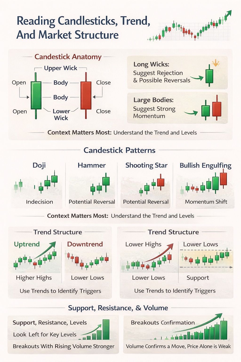
Candlestick Anatomy
Each candle has three main parts: the body, the upper wick, and the lower wick.
The body shows the difference between the opening and closing price
The upper wick shows how high price moved during that period
The lower wick shows how low it moved.
If the close is higher than the open, the candle is bullish. If the close is lower than the open, it is bearish.
Long wicks can be a sign that one side lost control before the candle closed. A long upper wick may show that buyers pushed price up but could not hold those gains. A long lower wick may show that sellers pushed price down but failed to keep control. Large bodies usually point to stronger pressure in one direction, with less of the move being reversed before the close. Still, these details become much more meaningful when they appear around clear price levels or inside an obvious trend.
Four Beginner Candlestick Signals That Actually Matter
Beginners do not need to memorize every pattern on the internet. A small number of useful signals is enough. The goal is to learn how to recognize them, understand what they may suggest, and avoid reading them without context.
1. Doji
A doji has a very small body, which tells you that the open and close were very close together.
It can suggest hesitation or balance. Price moved during the candle, but neither side finished with much control.
That only becomes useful when the candle appears at a meaningful level. A doji in the middle of choppy sideways price action often says very little. A doji at support after a decline, or at resistance after a rally, is more worth watching because it can signal that momentum is beginning to fade.
2. Hammer
A hammer has a small body near the top of the range and a long lower wick.
It can suggest that sellers pushed price lower during the period, but buyers stepped in and forced it back up before the close.
But the shape alone is not enough. A hammer that forms after a decline and near support carries more weight than one that appears in the middle of random price action. In most cases, location tells you more than the pattern by itself.
3. Shooting star
A shooting star has a small body near the lower part of the range and a long upper wick.
It can suggest that buyers pushed price higher but could not hold control into the close.
Again, context does the real work. A shooting star near resistance or after an extended move up carries more weight than one buried inside choppy price action. One candle on its own does not end an uptrend.
4. Engulfing candle
An engulfing pattern forms when one candle’s body fully covers the previous candle’s body.
A bullish engulfing candle can suggest buyers are taking control. A bearish engulfing candle can suggest sellers are taking control.
But here too, the pattern means more when it appears at an important area. An engulfing candle around support or resistance says more than one forming inside random chop. The candle is the signal. The location is what gives it meaning.
How To Identify Trends At a Glance
The quickest way to identify trend in a crypto chart is to look at swing structure first, not indicators.
An uptrend means price is making higher highs and higher lows. A downtrend means price is making lower highs and lower lows. A range means price is moving sideways between levels instead of trending cleanly in one direction. That simple check tells you a lot before you add anything else to the chart.
This is why you should identify the trend before using indicators. If price is clearly in a downtrend, a bullish signal on a very small timeframe is usually less reliable. If price is in an uptrend and pulling back into support, the same signal becomes more useful. Beginners often flip that process around and look for indicators first, when the swing structure already tells the bigger story.
Support, Resistance and Trend Lines
Support and resistance are usually the first levels beginners should learn to mark properly.
The simplest way to do it is to look left on the chart and find places where price reacted more than once. If price repeatedly stalled, bounced, rejected, or broke hard from an area, that area is worth marking. Repeated reactions matter more than one random touch.
The best habit here is to mark zones, not razor-thin lines. Markets often react inside an area, not at one exact price. Trend lines can help as well, but they are best treated as guides rather than magic lines. They become more useful when they line up with horizontal levels or clear swing structure, not when they are drawn through every minor move on the chart.
For more context on how traders use these levels inside real setups, our piece on crypto trading strategies expands on support, resistance, and breakout logic.
How Volume Confirms or Weakens a Move
Volume analysis helps you judge how much participation is sitting behind a move.
In general, breakouts with rising volume are stronger because more traders are involved in the move. Low-volume breakouts tend to fail more often because the push lacks the same level of participation. Inside a range, volume often dries up as price compresses. When price finally breaks out, volume often expands with it.
The main rule is that volume should confirm price, not replace it. Price still comes first. Volume is there to help you judge whether the move looks supported or weak. If price breaks a level but volume does not really build, caution usually makes sense.
The Starter Indicator Toolkit for Reading Crypto Charts
Indicators can help, but they should come after price action and support and resistance, not before. The goal is not to load the chart with signals. It is to use a small number of tools that make trend, momentum, and volatility easier to read.
 A Beginner-Friendly Visual Guide To Crypto Chart Indicators, Trend Confirmation, Momentum Signals, Volatility, And Smarter Setup Reading
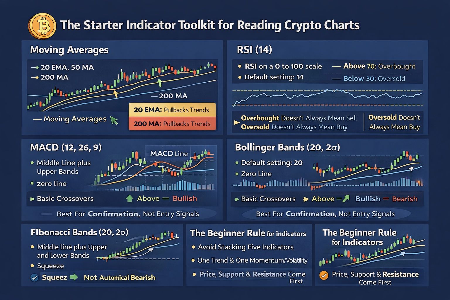
Moving Averages: The Simplest Trend Filter
Moving averages are usually the easiest place to start because they smooth out price and make trend easier to spot.
For a basic chart, three are enough: the 20 EMA, the 50 moving average or EMA, and the 200 moving average.
The 20 EMA reacts quickly, so it is useful when you want to see whether price is still respecting a trend during pullbacks. The 50 moving average gives you a cleaner medium-term view. The 200 moving average is the longer-term level many traders keep an eye on because it often acts as a broad reference for market direction.
A simple beginner rule works well here. If price is above the 50 and 200, that usually points to a bullish bias. If price is below the 50 and 200, that usually points to a bearish bias.
The 20 EMA is a bit different. It is less about long-term bias and more about tracking the flow of a move. In a clean trend, price will often pull back toward it before continuing. In sideways markets, though, moving averages tend to flatten out and lose a lot of their usefulness.
RSI (14): Momentum In Plain English
RSI is popular because it is simple. It puts momentum on a scale from 0 to 100, which gives you a quick sense of whether a move is stretched or still has room. The default setting is 14, and the two levels most traders know are 70 and 30.
That is the easy part. The part that trips people up is what those levels actually mean.
A lot of beginners see above 70 and think sell, or below 30 and think buy. In real markets, it does not work that neatly. In a strong uptrend, RSI can stay elevated for longer than you would expect. In a strong downtrend, it can stay weak for a while too. So an overbought reading is not some kind of automatic sell signal, and an oversold reading is not a green light to buy.
A better way to use RSI is to read it alongside the chart, not against it. If price is pulling back into support during an uptrend and RSI cools off without completely falling apart, that can be useful. If price is pushing into resistance and RSI is already weakening, that signal carries more weight than a random reading in the middle of choppy price action.
RSI works best when it helps you judge momentum around important levels. On its own, it is easy to misuse.
MACD (12, 26, 9): Momentum Shifts and Confirmation
MACD is another tool for reading momentum, but it is better used as backup than as a decision-maker.
With the standard 12, 26, 9 settings, the MACD line tracks the gap between a shorter moving average and a longer one. The signal line smooths that out. What you are really watching is whether momentum is starting to strengthen or weaken.
The basic read is simple enough. If the MACD line crosses above the signal line, momentum may be turning more bullish. If it crosses below, momentum may be shifting more bearish.
But the crossover is only one piece of the signal. The zero line also helps show the broader momentum backdrop. A bullish crossover happening below zero is different from one happening above it. One may be showing early improvement after weakness, while the other is happening in a market that already has stronger momentum behind it.
That is why MACD usually works better as confirmation than as a standalone trigger. If price is already breaking a level cleanly, or trend structure is already improving, MACD can help confirm that shift. If the chart itself looks messy, a crossover on its own does not suddenly make the setup good.
Bollinger Bands (20, 2σ): Volatility and Squeeze Setups
Bollinger Bands are a practical way to read volatility. They use a middle line with an upper and lower band that expand and contract as market conditions change. The standard setup is 20 periods and 2 standard deviations.
When the bands tighten, it usually means volatility is drying up. That kind of squeeze can come before a larger move. What it does not tell you is which direction that move will go.
A squeeze signals compression in the market, but not the direction of the next move. The breakout can still happen either way.
It is also worth avoiding the common trap of treating the outer bands like fixed reversal walls. In a strong uptrend, price can keep pressing the upper band without that being bearish. In a strong downtrend, price can keep riding the lower band without that being bullish. Bollinger Bands are better for showing changing volatility than for calling tops and bottoms by themselves.
Fibonacci Retracement: Optional, Not Essential
Fibonacci retracement is one of those tools that gets a lot of attention, but beginners do not need to build their whole chart around it.
The levels people usually focus on are 38.2%, 50%, and 61.8%. These are commonly treated as possible pullback zones after a directional move. That is the right way to think about them: possible zones, not automatic turning points.
Fibonacci works better as a secondary tool than a primary one. If trend, support and resistance, and volume are already clear, it can add a bit more structure. If those basics are not clear, Fibonacci usually just gives you more lines to stare at.
The Beginner Rule For Indicators
The main rule is simple: do not stack five indicators on one chart.
For most beginners, one trend tool and one momentum or volatility tool is enough. More than that usually makes the chart harder to read, not easier.
So a clean starter setup might look like this:
| Goal | Tool |
|---|---|
| Trend filter | 20 EMA, 50 moving average, or 200 moving average |
| Momentum check | RSI or MACD |
| Volatility check | Bollinger Bands |
The bigger point is that indicators should confirm what the chart is already suggesting. They should not be doing all the thinking for you.
Price action comes first. Support and resistance come first. Indicators sit behind that. When beginners get into trouble, it is usually not because they need more indicators. It is because the chart structure was never clear to begin with.
If you want a wider beginner overview of technical analysis before going deeper into indicators, our basic crypto trading guide for beginners is a useful companion read.
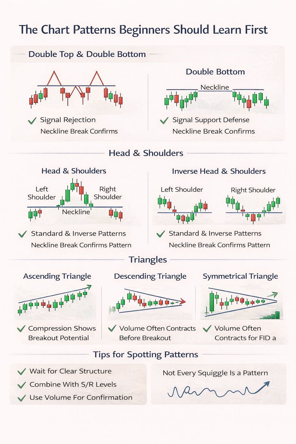
The Chart Patterns Beginners Should Learn First
Beginners in crypto should learn double tops and double bottoms, head and shoulders, and basic triangle patterns first because they are common, visually clear, and useful for spotting possible reversals or breakouts. They work best when combined with support, resistance and volume, rather than treated as stand-alone signals.
 Simple Visual Guide To The First Chart Patterns Beginners Should Learn To Read And Recognize
Double Top and Double Bottom
A double top usually forms when price tests a resistance area twice and fails both times. A double bottom is the mirror image, with price holding a support area on two separate tests. These patterns can be useful because they often show where the market is running into resistance or where support is continuing to attract buyers.
The main thing to watch is the neckline. In a double top, that is the swing low between the two peaks. In a double bottom, it is the swing high between the two lows. The pattern is usually treated as confirmed only when price breaks that neckline. Until then, it is just a possibility, not a finished reversal.
Head and Shoulders
A head and shoulders pattern has three main parts: a left shoulder, a higher head, and a right shoulder. The inverse version flips that structure after a decline. It is one of the better-known reversal patterns, but it is also one of the easiest to force onto a messy chart when the structure is not really there.
Spotting the shape is only the first step. The neckline is what gives the pattern structure. That is the level connecting the base of the pattern, and it is usually the break of that line that gives the setup meaning. Without the neckline break, you do not have confirmation. You just have a chart that vaguely resembles a pattern.
Triangles
A triangle pattern is a compression setup. Price gets squeezed into a tighter area as the boundaries converge, and that tightening often leads to a later breakout.
An ascending triangle has flat resistance and rising lows. A descending triangle has flat support and falling highs. A symmetrical triangle has both sides converging as lower highs and higher lows tighten price into an apex.
The useful part here is understanding what compression means. The market is coiling. Buyers and sellers are narrowing the range, and that often comes with volume drying up during the formation. When price finally breaks out, volume often expands again. That is why traders usually wait for the breakout instead of trying to guess direction too early.
How To Avoid Pattern-Spotting Fantasy
This is the part beginners need to hear most: not every squiggle is a pattern. If you have to stare at the chart and convince yourself the shape is there, it probably is not worth trading. Clean patterns tend to stand out. Forced ones usually fall apart the moment price moves against the idea.
The safer habit is to wait for confirmation. A pattern on its own is weaker than a pattern lining up with support and resistance and backed by volume. That combination is where these setups become more useful. Pattern first, then level, then participation. Not the other way around
Two Simple Ways to Read a Crypto Chart Step by Step
This is where the parts come together. These examples are educational, not trade calls. The goal is to show how a beginner can read a setup without turning the article into a signal service.
01
Example 1: Trend-pullback setup
A trend-pullback setup is often the easiest place to start because it lets you work with the trend rather than against it.
Example 1: Trend-pullback setup
Look for higher highs and higher lows. If the swing structure is not there, the setup loses its base.
Use the recent swing low as the closest support area and the recent swing high as the nearby resistance area. Keep it simple. One or two good zones are enough.
You are looking for a pullback inside the trend, not a full structure break. A shallow pullback into the 20 EMA or a prior horizontal support zone often gives clearer context than a random dip.
RSI does not need to stay high. It just should not collapse if the trend is still healthy. A moderate cooldown is different from clear momentum damage.
This could be a strong bullish candle off support, a reclaim of a minor level, or a bullish close back above the 20 EMA. The point is to let price prove that the pullback may be ending.
This keeps risk tied to structure. If price breaks the swing low, the setup is weakened or invalidated. The prior high is a basic reference point for where price may test next.
What to consider:
This setup works better in a clear trend than in a choppy range. It is educational, not prescriptive. The chart still needs confirmation.
Common beginner mistake:
Buying the first red candle that touches an EMA without waiting for support to hold.
02
Example 2: Range-breakout setup
A range-breakout setup teaches patience because the best part is often the wait.
Example 2: Range-breakout setup
Mark the area where price has repeatedly bounced between a clear range high and range low.
Use zones rather than exact lines. Range edges are usually areas, not perfect numbers.
You want signs that volatility is shrinking. The tighter the structure becomes, the more attention a breakout deserves.
A breakout should attract participation. Weak volume makes the move easier to fade and easier to reverse.
A momentum shift on MACD can support the breakout read, but MACD should confirm the move rather than lead it.
A retest of the broken range boundary is often cleaner than buying the first large breakout candle or shorting the first hard breakdown candle.
What to consider:
Not every range breaks cleanly. Some breakouts snap back into the range. Define invalidation before the break happens.
Common beginner mistake:
Entering out of excitement because the first breakout candle looks dramatic.
03
The four-question chart-reading checklist
This checklist keeps the process anchored.
The four-question chart-reading checklist
-
?
What is the trend?
-
?
Where are the key levels?
-
?
Is volume confirming?
-
?
What invalidates the setup?
What to consider:
If you cannot answer all four, the chart read is incomplete.
Common beginner mistake:
Acting on a setup before the invalidation point is clear.
If you want a broader foundation before using these examples, our guide to crypto market strAll cards are collapsed by defaultuctures adds context around trend and range conditions, while TradingView’s candlestick chart overview is a useful reference for the chart basics behind these setups.
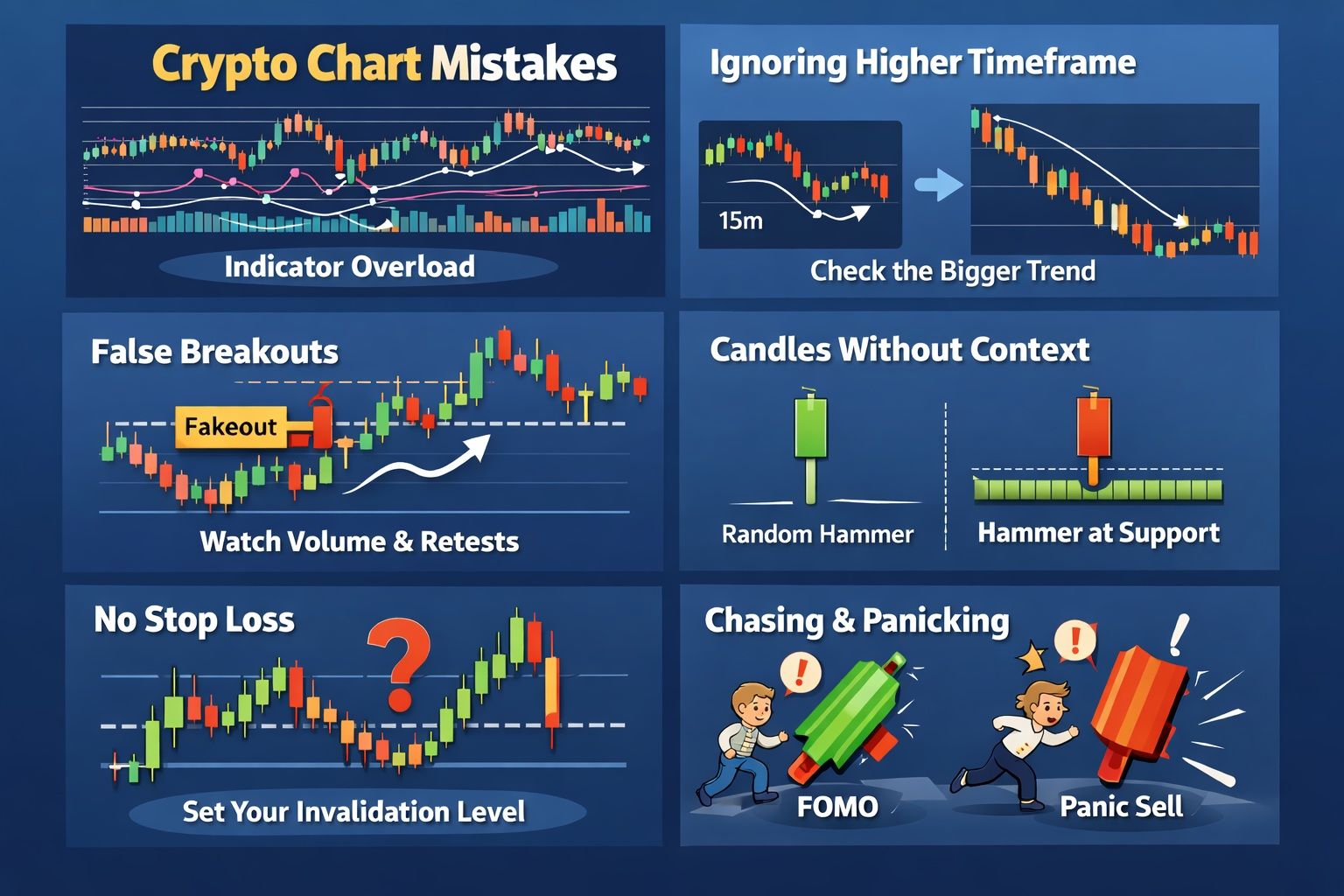
Common Crypto Chart Reading Mistakes Beginners Make
Beginners most often go wrong by overloading charts with indicators, ignoring the higher timeframe, trusting every breakout, and reading candles without enough context. They also tend to enter without a clear invalidation point and let emotion take over by chasing green candles or panic-selling red ones.
 Six Common Crypto Chart Reading Mistakes Beginners Make And How Better Context Improves Trading Decisions
Using Too Many Indicators
This is one of the quickest ways to lose clarity on a chart. A pile of indicators can make the setup look more serious, but it often just makes it harder to read. If price is already reacting in a clean way around support and resistance, more tools usually do not improve the analysis.
A better starting point is simple. Read price first, mark the obvious levels, and then add one or two indicators only when they help confirm trend, momentum, or volatility. If the chart still looks confusing, the issue is usually not the number of tools. It is that the market structure is not clear enough yet.
Ignoring the Higher Timeframe
A lower-timeframe setup can look great when viewed on its own, but that can change once you zoom out. A bullish 15-minute setup inside a strong daily downtrend does not carry the same quality as one forming within a daily uptrend.
For beginners, it makes more sense to start with the 1D or 4H chart for context, then move lower only if you need better timing. The bigger chart should shape the idea. The smaller chart should only refine it.
Treating Every Breakout as Real
Not every breakout deserves trust. Crypto throws out plenty of fake moves, and fake breakout setups are common enough that they should be expected, not treated like rare exceptions.
The better habit is to slow the read down. First check the level. Then check whether volume actually builds on the move. Then watch whether price can hold the break, especially on a retest. A breakout that falls straight back through the level was not much of a breakout in the first place.
Reading Candles Without Context
This is where a lot of beginners get stuck with candlestick patterns. They learn the names, then start treating every hammer, doji, or engulfing candle like it means the same thing everywhere. It does not.
A hammer in the middle of random price action means very little. A hammer forming at support after a decline is far more useful. The candle itself is only one part of the signal. Trend, support and resistance, and volume are what give the pattern real significance.
Entering Without an Invalidation Point
A chart idea is not really finished until you know where it is wrong. That is what invalidation is for. If the level or structure that supports the setup fails, the trade idea needs to be questioned or closed.
This is where chart reading connects directly to risk management. Without a clear invalidation point, exits tend to become emotional. With one, risk stays tied to structure instead of fear.
Chasing Green Candles and Panic-Selling Red Candles
This is the most obvious emotional mistake, so it is worth keeping it simple. If a move has already run hard without you, that does not automatically make it a good entry. And if one red candle appears after you enter, that does not automatically mean the setup is broken.
The practical fix is not complicated: keep position size small enough that you can still think clearly, and keep coming back to the chart structure instead of reacting to every candle. This is not really a psychology section. It is just a reminder that discipline gets a lot easier when the chart is clean and the risk is defined.
If you find yourself chasing candles or reacting emotionally to every move, our guide to crypto trading psychology explains how volatility can turn a simple chart setup into a discipline problem.

Final Verdict
Reading a crypto chart is a learnable skill. It does not require a wall of indicators, a paid signal group, or a reckless appetite for risk. Beginners need one chart type, a sensible timeframe, a way to identify trend, a few support and resistance zones, a volume check, and one or two indicators for confirmation.
The strongest beginner workflow is simple:
- Pick a timeframe.
- Identify the trend.
- Mark support and resistance.
- Check volume.
- Use one or two indicators.
- Define invalidation.
That process improves structure. It does not create certainty. A chart helps you organize decisions and manage risk more clearly. It does not remove uncertainty from a volatile market. Learn the visual language first, keep the process tight, and let repetition do the work. This article is educational only and not financial advice.